Article
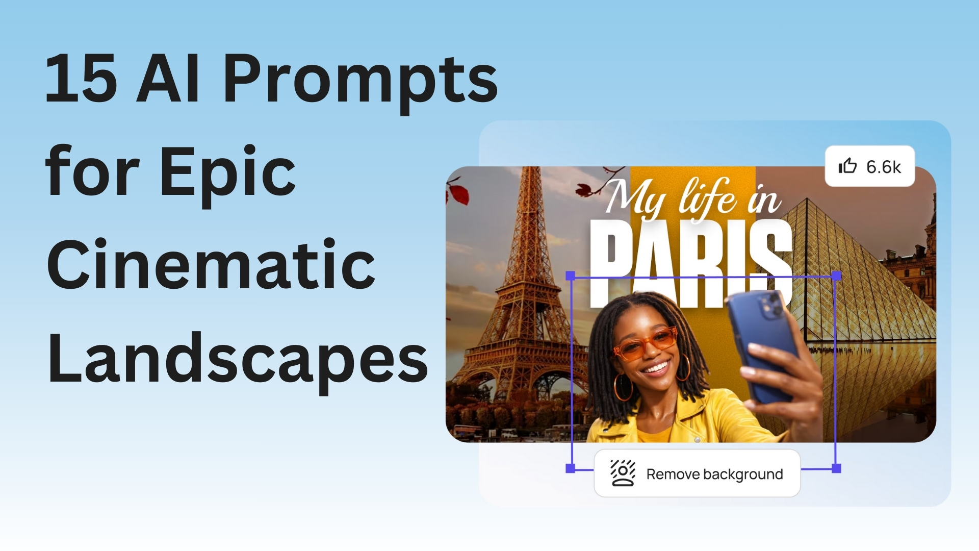
How to Design a YouTube Thumbnail That Gets Clicks
Your thumbnail is the first thing people see. Learn how to design YouTube thumbnails that actually get clicks with simple, proven strategies that work.
Your thumbnail is the first thing people see. Learn how to design YouTube thumbnails that actually get clicks with simple, proven strategies that work.
Your thumbnail is what people see first. If it sucks, they skip your video. If it's good, they click. Simple as that.
Think of it like a billboard for your video. You got maybe one second to grab someone before they keep scrolling. So how do you make a thumbnail that actually works?
I've been making thumbnails for a while. Some got a ton of clicks. Most were total garbage. But I figured out the formula.
Biggest mistake ever? Cramming too much crap into one thumbnail.
People try to fit their face, some text, their logo, random objects, fancy graphics. It ends up looking like visual vomit.
Here's what actually works: Pick ONE thing. One face. One object. Maybe 3-5 words of text. That's it. Done.
Why? Most people watch YouTube on their phones. Your thumbnail shows up tiny as hell. If there's too much going on, nobody can tell what your video is even about.
Look at the thumbnails YOU click on. They're usually simple, right? There's a reason for that.
If you're in the video, put your face in the thumbnail. But don't just stand there looking bored.
Make a face. Surprised? Excited? Mad? Confused? Whatever fits your video.
People connect with faces that show emotion. It's just how brains work.
And get CLOSE. Your face needs to be big enough that someone can see your expression on a tiny phone screen. Look directly at the camera too. Eye contact works, even in a picture.
Every big YouTuber does this. MrBeast. MKBHD. Linus Tech Tips. They all use emotional faces because it gets clicks.
If you put text on your thumbnail (and you probably should), make it HUGE.
Bigger than you think it needs to be. Then double it. I'm serious.
Use 3 to 5 words max. Not a whole sentence. Not a paragraph. Just the main point of your video.
Stuff like:
Short and punchy.
Use a thick, bold font. Those skinny fancy fonts look like garbage on thumbnails. And use contrasting colors - white text on dark backgrounds, or dark text on light backgrounds. No gradients. No fancy effects that make it hard to read.
YouTube's interface is mostly white and gray. So if your thumbnail has bright colors, it pops out like crazy.
Red, yellow, blue, green - these work great. But don't use all of them together. Pick 2-3 colors max. Using every color looks insane.
Also, check what colors other videos in your niche use. If everyone's using blue, maybe try orange. Stand out from the pack.
Your thumbnail needs to grab eyeballs. That means high contrast.
Showing a product? Put it on a plain background. Showing your face? Make sure you're not blending into the background like a chameleon.
Pro tip: Add a slight shadow or glow around important stuff. Makes things pop even more, especially when the thumbnail is small.
Go to YouTube. Search for videos like yours. Look at the top results. What are their thumbnails doing?
I'm not saying straight-up copy them. But notice what's working. Are they using faces? What colors? How much text?
Then do something similar but better. If everyone's doing shock faces, do an excited face. If everyone uses red, try yellow.
Stand out, but not so much that people can't tell what your video is about.
Most YouTube views happen on phones. Period.
Your thumbnail looks amazing on your computer? Cool story. What about on a phone?
Before you publish, check the thumbnail on your phone. Can you read the text? Can you see the important parts? If not, simplify it.
A thumbnail that only works on a computer is basically useless.
Once you find something that works, keep doing it. Same fonts. Similar layouts. Same colors.
When someone sees your thumbnail, they should know it's YOUR video before they even read the title.
Look at any big channel. Their thumbnails all follow the same pattern. That's not laziness. That's branding. People see it and go "Oh that's a [channel name] video."
Let me save you some pain. Here's what doesn't work:
Clickbait lies - Don't use clickbait that has zero to do with your video. Sure, you might get the click. But people will bounce immediately and YouTube will bury your video.
Tiny text - If I can't read it on my phone, it's worthless.
Blurry images - Low quality looks unprofessional. Period.
Arrow overload - One arrow pointing at something interesting? Fine. Seventeen arrows and circles everywhere? You look desperate and spammy.
Canva works great and it's free. They even have pre-made YouTube thumbnail templates.
Want more control? Try Photopea (free Photoshop in your browser) or GIMP (free desktop software).
Some people use Figma. Some use freaking PowerPoint. The tool doesn't matter nearly as much as understanding what makes a good thumbnail.
Real talk: Your first thumbnails are gonna suck. That's completely normal. Everyone's first thumbnails were trash.
Make a thumbnail. Upload your video. Check if people are clicking. If they're not, make a different thumbnail next time.
YouTube Analytics will show you your click-through rate. Low number = thumbnail needs work. High number = keep doing what you're doing.
Making good thumbnails is a skill. You get better by actually doing it.
A killer thumbnail with a boring title won't get clicks. A killer title with a boring thumbnail won't either.
They need to work as a team.
Think of your thumbnail as a promise: "Click this and you'll learn something" or "Click this and you'll laugh."
Then your video better actually deliver on that promise. Otherwise people will stop trusting your thumbnails.
The best thumbnails are clear, simple, and make people curious. That's the whole game.
You don't need expensive software. You don't need years of design school. You just need to understand what makes people want to click.
Now go make some thumbnails. If one doesn't work, try something different. That's literally how you get good at this.
Tools to Help:
More Helpful Stuff: